| nr. | image | description by the author |
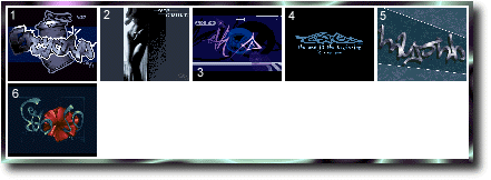
| 1 | Beyond | [o3/97] This logo is for an american crew called BEYOND. We
thought to compete at the WiRED'96 demo compo, but
due to the biggest problem ever - the lack of time -
we didn't. Maybe there will be a release by BEYOND
including some pieces of art by me.
We got into contact when PRYROMANiAC (hi paul!) sent
me a mail after one of my articles regarding design
had been published in the iMPHOBiA mag.
Maybe we'll do a jETSET-type demo with this logo :)
|
| 2 | E9_fatal | Small little 17-colors-piccy in shades of blue, done in
[o3/97] one night to possibly be included in ETHOS9's 64K-Intro
for the MEKKA/SYMPOSiUM'97-Intro-Compo.
Now there is a logo, a font, a fullscreen & - of course
- a song. I estimated that we have about 35K left for
the code :) - My only hope is that the whole Intro will
be run in 320/256, so we won't have to cut away some
parts, or change the aspect ratio (and besides that we
won't have the screen flashing while changing the modes
from one to another).
The original of this pic was printed in Madonna's book
"EROTiCA" (or the other one, don't remember it anymore)
Right now my only fear's that these 2 pics will collide
|
| 3 | E9_eve_e | [o9/97] This logopic has probably one of the weirdest histories
that I've ever witness. It all started out with another
logo in this very same style by DESERT. He did it for a
intro called ESTELLE, which was supposed to be released
by FUNK someday, but as FUNK ceased to exit, we (ETHOS9
and exFUNK) came up with the idea to finish and release
it as a demo-coop.
Thus I thought to create a logo for ETHOS9 in that very
style. So I picked up drawing the evening before I left
for a short trip to France & Paris. Certainly I wasn't
able to finish that logo, but I've nevertheless sent it
to assign, to have him find someone to finish it. When
I returned home, I found that DESERT changed my preview
quite drastically and it was up to me again to actually
finish it off (aliasing, and some of the filling). Also
he did use some colors that I didn't like, so I changed
them, too... pretty nerd, eh? ;) |
| 4 | E9_eve_l | [o8/97] Here you see the result of half an afternoon of work or
so. I got the inspiration for this one while watching a
raw-preview of the last demo, FUNK is going to do. It's
going to be an ETHOS9-FUNK cooperation to make it a big
farewell for the quite successful FUNK-team.
The 'special' inspiration came, when the demo reached a
screen, drawn by DESERT. It's a logo/text-screen saying
"u should be proud to c this" with a grafitti-type logo
displaying the "be".
So I thought to do some more pictures fitting the style
set by DESERT. Apparently this is the first of those to
come :). Btw the sentence below this logo is adapted :)
from THE SMASHING PUMPKINS (theme from Batman 4).
Let's hope one of our coders finds a way to initalize a
640x256x16c-mode on pc ;) |
| 5 | Haujobb | [o1/97] A logo done for the Amiga crew HAUjOBB. On the drive
homewards from where we celebrated the 96/97 annual new
year boozing , the organizer of HAUjOBB asked me to
do some logos for them - so well here's the first one.
Maybe I'll join their nice team soon, to be one of the
fewer pc-artists that join in an amiga crew while still
drawing on the pc. (though I have to say that I also
have a modified/boosted A12oo (68o3o/5oMhz) :) |
| 6 | E9_ems2l | [o5/97] Now this was a 'hardcore' piece of work. I was asked to
finish this logo 2 days before the actual to-be-release
date (19th may '97). ARTOS, our second artist started
this pic some weeks ago. So basically the outlines and
a rough sketch of colors was given. Also the first two
letters were done, by the time I got to lay my hands on
this.
As Artos has run out of time, due to several other pics
and projects he was/is working on, I was asked if I was
willing to finish it off. After some discussions, I had
accepted this 'job'. So I had exactly 2 days to finish
this pic - drawn (so far) in a style, I'm /was not used
to. Well the first thing I did was completeing the "T"
and filling the whole "H". Then I took a break from the
letters as I wasn't really satisfied with my way of do-
ing his style and started working on the flower.
Several hours later (basically the time between 18.00pm
and 05.00am on monday) I had finished the flower to get
some rest (till 09.30am, monday).
So about 4 hours later I started working on the "S" and
on the "9". After that I did a rush background.
Man - I seem to need the pressure to work efficently ;)
because I started working on a guitar pic when I ended
the menu (which was actually on saturday evening), even
before starting to work on this one... :)
|